
Most indicators show you a screenshot and a win-rate. We’ll show you the data instead — across a century of the S&P 500 and 40 instruments, including what the model can’t do. Here’s what our working paper found.
A simple band drawn from how price has recently been moving contains the next close inside its expected range about 71% of the time — and, historically, that number barely moves. It held in every decade of the S&P 500 from 1928 to 2024, and across 40 instruments in five asset classes. That consistency — not the exact percentage — is the finding.
All figures below are historical and were measured in research. Past behavior is not a guarantee of future results.
On daily S&P 500 data from 1928 to 2024 — about 24,000 trading days — the next close landed inside the expected range 71.2% of the time.
It wasn’t a lucky window. Broken down decade by decade, containment stayed in a narrow 68.7%–73.7% band through the Great Depression, World War II, the 1987 crash, the 2008 crisis, COVID, and the recent AI-driven market — eleven calendar decades that changed almost every other property of the market, yet barely moved this one.
| Decade | Days | Inside the range | 95% CI | Period |
|---|---|---|---|---|
| 1930s | 2,496 | 73.6% | [70.9, 75.8] | Great Depression |
| 1940s | 2,500 | 73.7% | [71.6, 75.6] | WWII, post-war |
| 1950s | 2,511 | 72.5% | [70.6, 74.8] | Bretton Woods |
| 1960s | 2,489 | 70.4% | [67.8, 73.4] | Vietnam, Nifty Fifty |
| 1970s | 2,526 | 68.7% | [66.3, 70.8] | Stagflation |
| 1980s | 2,528 | 70.5% | [68.2, 72.5] | incl. 1987 crash |
| 1990s | 2,528 | 70.5% | [68.6, 72.5] | Tech expansion |
| 2000s | 2,515 | 69.6% | [67.2, 71.8] | Two recessions |
| 2010s | 2,516 | 72.3% | [69.4, 75.1] | Low-vol bull |
| 2020–2024 | 1,200 | 70.2% | [66.0, 74.6] | COVID, AI cycle |
| Full sample | 24,248 | 71.2% | [70.4, 71.9] | 97 years |
S&P 500, inner ±1σ band, daily closes 1928–2024. Historical, measured in research; past behavior is not a guarantee of future results.
The same ~70–72% showed up across 40 instruments spanning five asset classes — individual stocks, indices and ETFs, major currencies, commodities like gold and oil, and crypto including Bitcoin and Ethereum. The cross-instrument average was ~72%, with little spread (most instruments landed between about 68% and 78%).
It even held across different wrappers of the same market — the cash index, the ETF, and the futures version of the same exposure all calibrated alike. A pattern that survives that many different instruments and wrappers isn’t an artifact of one dataset.
| Instrument | Class | Period | ±1σ | ±2σ |
|---|---|---|---|---|
| S&P 500 (cash)† | Index | 1928–2024 | 71.2% | 93.8% |
| SPY | Index ETF | 1995–2024 | 70.8% | 93.9% |
| QQQ | Index ETF | 1999–2024 | 70.6% | 93.8% |
| NASDAQ | Index | 1971–2024 | 70.3% | 93.8% |
| NVDA | Single stock | 1999–2024 | 73.5% | 94.6% |
| AAPL | Single stock | 2010–2024 | 73.0% | 93.9% |
| MSFT | Single stock | 2010–2024 | 72.9% | 93.9% |
| EUR/USD | FX | 2004–2024 | 71.0% | 94.8% |
| GBP/USD | FX | 2005–2024 | 70.3% | 93.8% |
| USD/JPY | FX | 2005–2024 | 72.0% | 93.6% |
| ES (S&P fut.) | Equity futures | 2005–2024 | 71.3% | 93.6% |
| ZN (10Y Treasury) | Treasury futures | 2007–2020 | 77.9% | 93.6% |
| Gold (futures) | Commodity | 2000–2024 | 72.7% | 94.0% |
| Oil (futures) | Commodity | 2000–2024 | 70.5% | 94.0% |
| Bitcoin | Crypto | 2014–2024 | 76.7% | 93.4% |
| Ethereum | Crypto | 2018–2024 | 75.4% | 93.4% |
| Universe mean (40) | — | — | 71.9% | 94.1% |
| Spread (SD) | — | — | 2.3 pp | 0.7 pp |
† S&P 500 is the non-tradable cash index (long-window benchmark); SPY is its tradable wrapper. Daily closes, n = 40. 95% confidence intervals are reported in the paper. Sample of 16 of 40 instruments shown; full table in working paper. Historical, measured in research; past behavior is not a guarantee of future results.
The obvious objection: “of course price stays inside a band built from its own volatility — that’s circular.” The working paper tested exactly that, by running the same method on thousands of simulated markets.
In other words, the few extra percentage points are a genuine fingerprint of how real markets behave, not an artifact of the math.
BTM looks like Bollinger Bands®, so the working paper ran them head-to-head on the same data.
BTM contained the next close ~70% of the time; price-based Bollinger Bands® managed only ~40%.
BTM held ~94% versus ~83% for standard Bollinger Bands® — and contained price more reliably on every one of the 40 instruments tested, at both inner and outer band.
Most of the difference comes from measuring volatility in return space rather than on raw price, which keeps the band centered in a trend instead of lagging and ballooning.
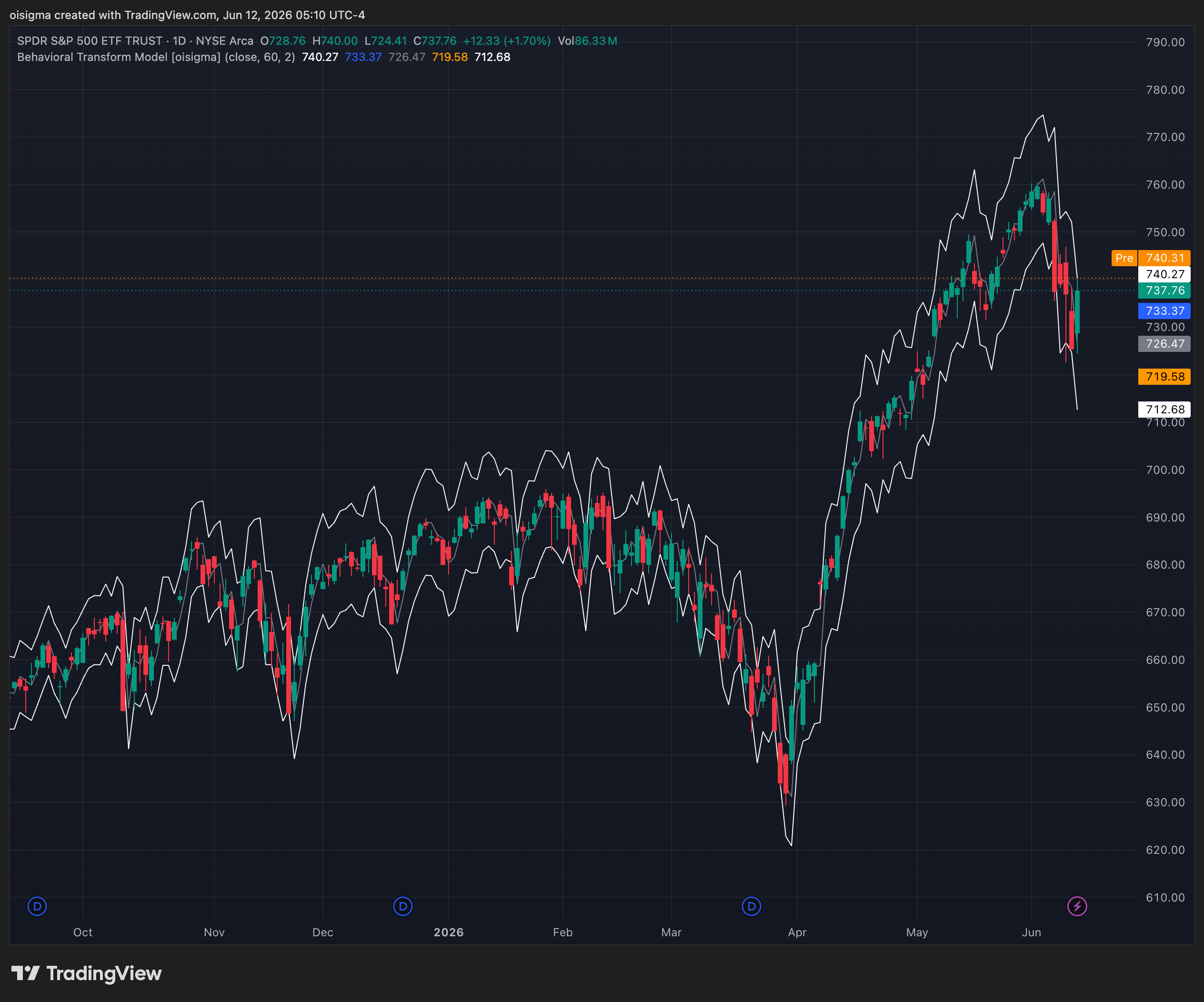
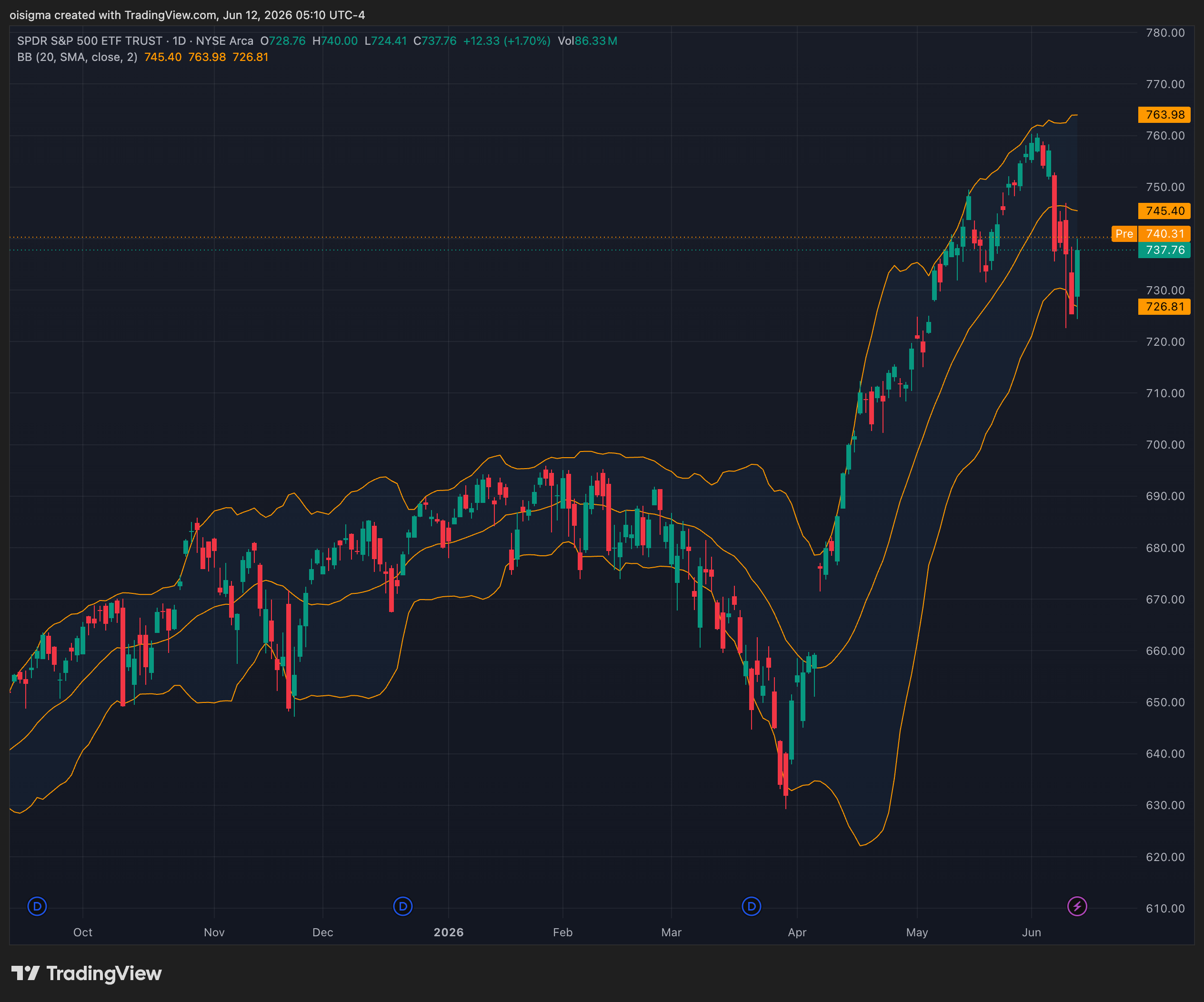
Same chart, two methods. Both panels show SPY daily candles from October 2025 to June 2026. Left: BTM's ±2σ band, measured in return space and recalculated every bar from the prior close. Right: standard Bollinger Bands® at their ±2SD default (20-period SMA, ±2 standard deviations of price). Notice how the price-based band lags and sits off-center through the April–June rally, while BTM's return-space band hugs price more symmetrically. Across the full 40-instrument test, ~94% of closes stayed inside BTM's band versus ~83% for standard Bollinger Bands® — the stretch shown is one illustrative example. Historical, not a recommendation; comparison on the containment metric only.
BTM is deliberately plain: a rolling average of recent volatility, no fitting and no tuning. The working paper compared it against the volatility models used in institutional risk management — GARCH and RiskMetrics® EWMA — and on the calibration task, the three are statistically indistinguishable. Sophistication buys essentially nothing here; the construction is what matters.
Two checks that it isn’t just fitting the past:
Splitting each instrument’s history in half, containment was essentially unchanged from the first half to the second.
On 79 randomly drawn U.S. stocks the model was never tuned on, containment averaged ~73.6%, and every single name cleared 70%. The diverse, curated universe was actually the harder test.
The honesty is the point. In a category full of overclaiming, here’s what the model does not do:
It does not predict price or direction. It describes where price is relative to its recent range; the center line carries almost no directional information.
It is not a signal service. No arrows, no entries, no “buy/sell.” It’s descriptive context for your own decisions.
It is well-calibrated on average, not in every moment. It’s a marginal-coverage classifier, not a perfect conditional forecast — formal tests confirm the average is right but the fit isn’t textbook-perfect.
The outer band is slightly optimistic in the deep tails, and the range runs too narrow in the first days of a fast crisis (when volatility spikes faster than recent history can register — containment fell to ~65% on the most extreme onset days). We’d rather tell you that than pretend otherwise.
It will not make you money on its own. It’s an analysis lens; profit depends on your own strategy, discipline, and risk management — and trading always carries the risk of loss.
One calibrated range, useful as context for several questions — all descriptive, none a strategy or a signal:
An objective alternative to hand-drawn support & resistance.An expected range, not a claim that price reverses at the edges.
A better-calibrated version of the band you may already use.
A calibrated reference for how wide “normal” is.Some traders cross-check it against the range options are pricing.
A read on when a move has stepped outside the normal range.
The working paper validates the range’s calibration — not the profitability of any particular way you might use it. Whether any such use delivers value after real-world costs is an open question. Options and other derivatives carry additional risk.
We don’t ask you to take our word for it. The full working paper documents the method, every figure above, the statistical tests, and the limitations in detail. It’s a working paper — complete and citable, but not yet peer-reviewed — and comments are welcome.
AlEssa, M. A. H. (2026). “How Well Does a Rolling-Volatility Band Calibrate? Evidence Across Asset Classes and Market Regimes.” oisigma.com LLC. Not peer-reviewed.
The evidence is the band’s calibration. The best way to judge it is to watch it recalculate on the markets you actually trade.
Start your free 30-day trial →30-day free trial, then $15/month billed monthly — auto-renews until you cancel. Cancel anytime.
Pick up where you left off.